smoothScatter with ggplot2
The motivation for this plot is the function: graphics::smoothScatter, basically a plot of a two-dimensional density estimator. In the following, I want to reproduce the features with ggplot2.
smoothScatter
To have some data I draw some random numbers from a two-dimensional normal distribution:
library(ggplot2)
library(MASS)
set.seed(2)
dat <- data.frame(
  mvrnorm(n = 1000,
          mu = c(0, 0),
          Sigma = matrix(rep(c(1, 0.2), 2), nrow = 2, ncol = 2)))
names(dat) <- c("x", "y")
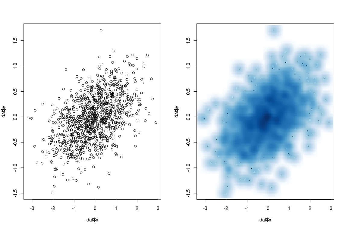
smoothScatter is basically a scatter plot with a two-dimensional density estimation. This is nice especially in the case of a lot of observations and for outlier detection.
par(mfrow = c(1,2))
plot(dat$x, dat$y)
smoothScatter(dat$x, dat$y)
smoothScatter in ggplot2
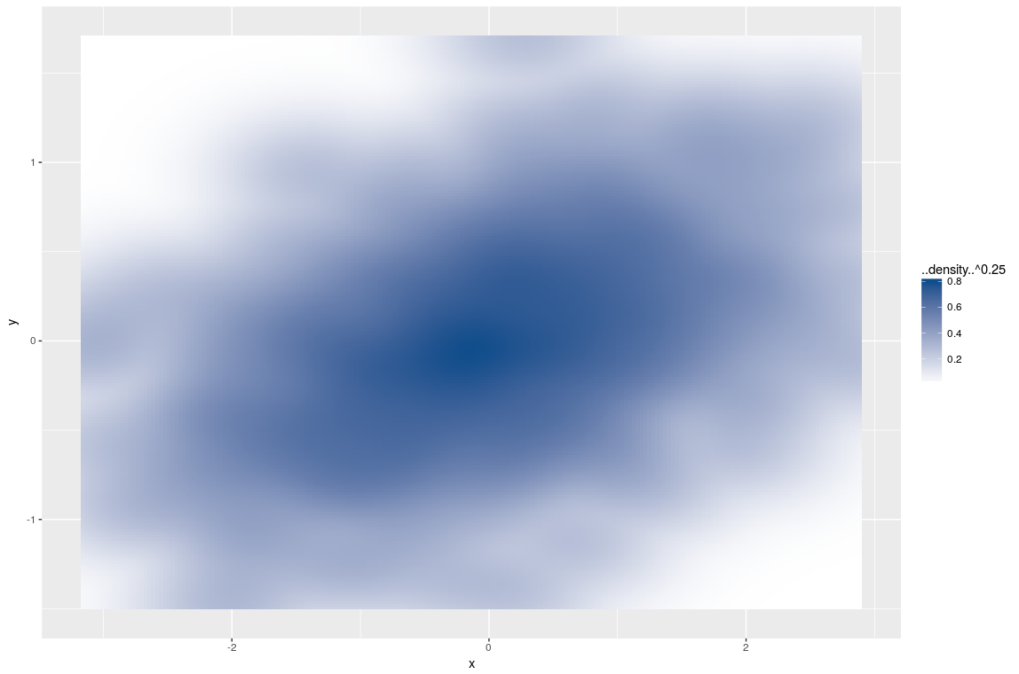
OK, very pretty, let's reproduce this feature in ggplot2. First thing is to add the necessary layers, which I already mentioned is a two-dimensional density estimation, combined with the geom called ‘tile’. Also, I use the fill aesthetic to add colour and a different palette:
ggplot(data = dat, aes(x, y)) +
  stat_density2d(aes(fill = ..density..^0.25), geom = "tile", contour = FALSE, n = 200) +
  scale_fill_continuous(low = "white", high = "dodgerblue4")
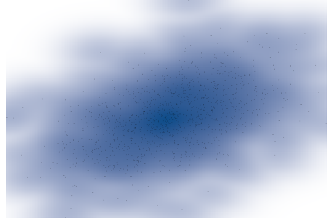
I add one additional layer; a simple scatter plot. To make the points transparent I choose alpha to be 1/10 which is a relative quantity with respect to the number of observations.
last_plot() +
  geom_point(alpha = 0.1, shape = 20)

A similar approach is also discussed on StackOverflow. Actually that version is closer to smoothScatter.
Changing the theme
The last step is to tweak the theme-elements. Not that the following adds to any form of information but it looks nice. Starting from a standard theme, theme_classic, which is close to where I want to get, I get rid of all labels, axis and the legend.
last_plot() +
  theme_classic() +
  theme(
    legend.position = "none",
    axis.line = element_blank(),
    axis.ticks = element_blank(),
    axis.text = element_blank(),
    text = element_blank(),
    plot.margin = unit(c(-1, -1, -1, -1), "cm")
  )
The last thing is to save the plot in the correct format for display:
ggsave(
  "scatterFinal.png",
  plot = last_plot(),
  width = 14,
  height = 8,
  dpi = 300,
  units = "in"
)
And that’s it, a nice picture which used to be a statistical graph.