The Representation of Corona Incidence Figures in Space and Time
in cooperation with Freie Universität Berlin correspondence address: ulrich.rendtel@fu-berlin.de
In media one can find various displays of the intensity and spatial distribution of fresh infections with the SARS-Cov-2 virus, which we denote for simplicity as Corona infections. Meanwhile most representations use the 7-days incidence per 100 thousand inhabitants. The cumulation over 7 days is due to the strong weekly seasonality of the reporting by the local health offices (Gesundheitsämter) to the federal epidemiological institute, the Robert-Koch-Institut (RKI). The reference to the number of inhabitants establishes a regional comparability between areas with high or low inhabitant figures. The regional reference unit for international comparisons is Germany as a whole. For decisions about regulations to dampen the Corona pandemic the level of federal states is chosen. The lowest regional level which is delivered to media by the RKI numbers are counties (Landkreise) and city districts. At this level the RKI presents a daily report on infection numbers, see the "täglicher Lagebericht des RKI zur Coronavirus-Krankheit-2019 (COVID-19)".
The map in Figure 1 is typical for the display of the 7-day incidence in German media at county level.
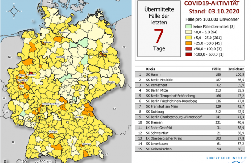 Figure 1: The incidence map at county level for October, 3, 2020 taken from the daily report of the RKI
It shows the regional distribution of incidences at a fixed date, October, 3, 2020, at the beginning of the second pandemic wave in Germany.
In many media such maps are animated by a mouse-over function which delivers additional information about the name of respective county and the exact incidence figure which is in general lost by the color coding of the map. Also, other information, like the absolute number of infections can be displayed in such interactive windows.
With respect to the temporal development of incidence figures line-plots are the preferred tools, mostly at the level of the 16 Federal States of Germany, see Figure 2.
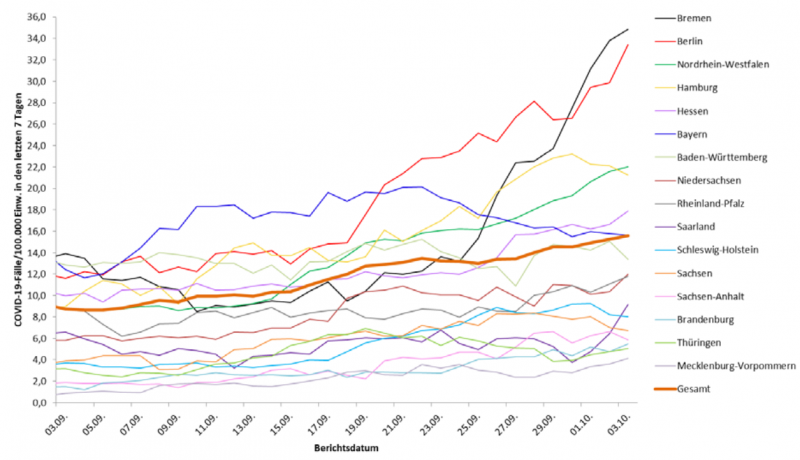
Figure 2: Comparison of the temporal development of incidence figures across Federal States. Source: Daily report of RKI October, 3, 2020.
A line plot at the level of the 412 counties would result in a diagram with 412 curves. Such a map would be hardly readable and difficult to interpret.
A full representation in space and time is at least in principle feasible by a combination of a county map with a time slider. However, such maps are almost nowhere presented in media. An exceptional case is presented by the ZEIT magazine (the map is quite hidden at the bottom of a larger presentation). However, this presentation is hardly capable to display the temporal development of local hotspots. The sequence of maps is too noisy to show up local clusters and their development over time.
Corona infections happen mainly at the level of spacial vicinity, for example at the job, at school, during shopping, at the restaurant, in public transport or simply in the own household. This implies the existence of local clusters with increased incidence numbers. Since lockdown regulations intend to reduce infections by restrictions of personal mobility (blockades of counties and vacation sites, closure of hotels) one should expect also some temporal stability of these clusters or hotspots. However, an adequate technique to display these temporal clusters is still missing in the media.
Because of the diffusion mode of the Corona virus we would not expect jumps of infection rates at the borderlines of the counties. The observed jumps in the county maps are due to the unrealistic assumption of a uniform incidence rate over the entire area of the county. This assumption is shared by all maps in the media. However, the RKI infection numbers are compatible with non-uniform infection risks in the county area. If we assume a smooth distribution of Corona infection risks over the entire area of Germany, we may estimate this distribution from the RKI counts at county level. Such an estimate results in a smooth function over Germany which is independent from the county borderlines. Its values represent the local infection density at a point. This density has to be normalized by an estimate of the local population density. Thus one obtains a local incidence number. Details of this statistical procedure one can find in: Groß, M.; Kreutzmann, A.-K.; Rendtel, U; Schmid, T.; Tzavidis, N. 2020: Switching between different area systems via simulated geo-coordinates: A case study for student residents in Berlin. Journal of Offcial Statistics, 36, 297--314, http://dx.doi.org/10.2478/JOS-2020-0016.
These local incidence numbers have the same meaning as the incidence figures in the standard county maps and they can be represented again by a map. Figure 3 compares the RKI incidence map and the alternative representation by local incidences for the same day.
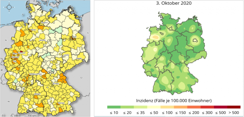 Figure 3: Comparison of Corona incidences at October, 3, 2020 Left: RKI county map Right: Alternative representation by estimated local incidences.
There is a noticeable hotspot southwest of Bremen in the western part of Germany, near a small town called Cloppenburg. This hotspot will turn out to be quite stable during the entire second pandemic wave in Germany. The rural area is characterized by big agricultural firms with animals. In a similar area somewhat near there happened in July 2020 a serious Corona outbreak in one of Europe’s biggest slaughterhouses (Tönnies at Reda-Wiedenbrück) with 2100 positively tested employees. The hotspot displayed here probably indicates a similar risk for corona infections. The hotspot Berlin is shown to influence the entire neighboring area of the surrounding state of Brandenburg. In North Rhine-Westphalia the RKI count map displays several different but near towns with higher incidence rates. These areas are melted to a single infection area in the map with the local incidences. A further hotspot is displayed near Czechia at a region called Oberpfalz. This area was an area with extreme high incidence figures during the first pandemic wave (1470 incidence at county Tirschenreuth in April, 21, 2020). At this date, it was suspected that a super-spreading event at a traditional beer festival has happened). On the other hand, the infection may be the result of the many incoming commuters from Czechia. This hotspot will be quite stable over the entire second pandemic wave. In order to produce a continuous temporal representation of hotspots, local incidence maps were computed from a moving 7-day interval. The interval starts at the beginning of the second pandemic wave (October, 1, 2020) and lasts until the actual date. This sequence of temporally ordered maps is displayed in a web environment which is freely available in the blog post COVID-19: Heat Map of Local 7-day Incidences over Time.
The presentation is equipped with a switcher for forward play and stop like in a video file. Additionally, there are two switchers to show the next or the previous day. This facilitates the temporal tracing of hotspots.
The map does not present major towns for orientation because this could disturb the notion of the local clusters. For this reason we used the mouse-over facility to display the location names and their temporal incidence profile. This facility displays the location name together with the ZIP code at the present mouse pointer position. By a mouse click, for example, at the center of a hotspot, one obtains a line plot of the incidence profile at this location. Figure 4 shows the fast increasing infection numbers for the city of Cloppenburg which only decline slowly and remain still above the level of 100 in March 2021.
By clicking a later point in time in the line plot, for example, the timepoint with the highest incidence value, the background map changes to the situation of this point in time, see Figure 5. Here we notice that the city of Cloppenburg is still one month later one of the hottest incidence areas of Germany. However, the level of infections has increased from 62 by a factor of 7 to 420.
Even in the final phase of the second pandemic wave the area of Cloppenburg is still a hotspot, see Figure 6. This temporal stability of a regional hotspot is remarkable and cannot be seen from the standard disease maps.
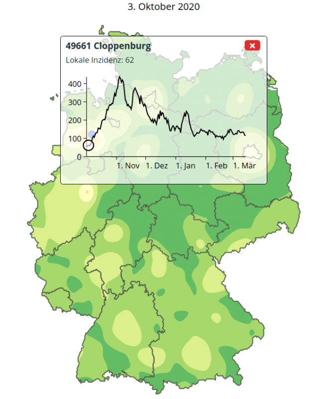
Figure 4: The temporal development of local incidence at the hotspot of Cloppenburg with background map of October, 3, 2020.
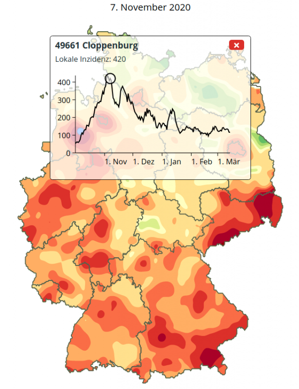
Figure 5: The temporal development of local incidence at the hotspot of Cloppenburg with background map of November, 7, 2020.
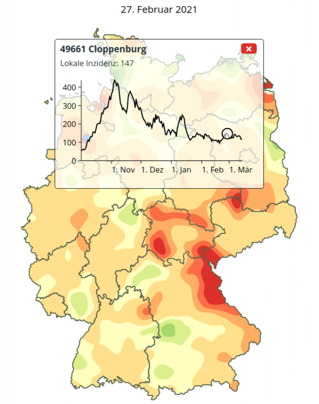
Figure 6: The temporal development of local incidence at the hotspot of Cloppenburg with background map of February, 27, 2021.
With this technique one may also identify so-called coldspots. In Germany the city of Rostock in the North-East of Germany at the Baltic sea plays is an exceptional case. Figure 7 demonstrates that the local incidence values stay during the entire pandemic wave with minor exceptions below the critical value of 50. At the peak infection time Rostock is surrounded by infection areas with considerably higher incidence figures. In Figure 7 the blue mark of Rostock in somewhat hidden by the label with the line plot.
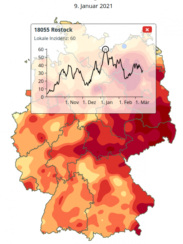 Figure 7: The temporal development of the local incidence at the coldspot Rostock with background map of January, 9, 2021.
Furthermore, infection areas evolve dynamically. So separate hotspots may enlarge in a short timespan or they may merge together. For example, on October, 30, 2020 there were three separate infection kernels at the city of Bautzen, at the edge of the mountain region Erzgebirge at the border to Czechia near the town of Annaberg and somewhat north the town of Riesa at the river Elbe, see Figure 8.
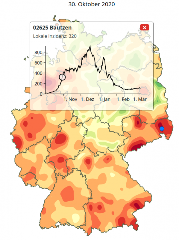 Figure 8: The temporal development of the local incidence at the hotspot Bautzen with background map of October, 30, 2020.
Almost two weeks later these infection areas have united to a joint infection area, which excludes only the major cities Dresden and Chemnitz, see Figure 9. One month later almost the entire federal state of Saxony has become a corona hotspot with an incidence number of 432, see Figure 10.
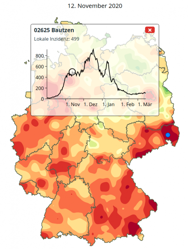 Figure 9: The merge of three local hotspots in Saxony: Bautzen, Annaberg (Erzgebirge) and Riesa. Background map November, 12, 2020.
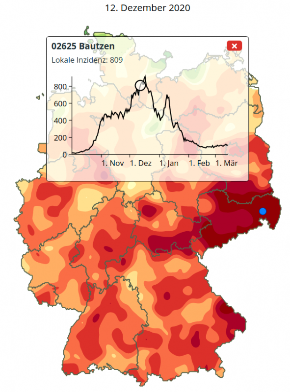 Figure 10: The merge of three local hotspots in Saxony: Bautzen, Annaberg (Erzgebirge) and Riesa. Background map December, 12, 2020.
Conclusions
With the algorithm described here, one can reveal large differences with respect to Corona incidence numbers for Germany. These hotspots may be regionally stable or they may spread dynamically. The position of hotspots and their temporal development give hints for potential causes of the spreading of the Corona virus.
In the case of Cloppenburg one could search for similar causes as in the case of the near Tönnies slaughterhouse factory. The coldspot Rostock has been known in the public for its early and consequent use of free Corona tests. In the case of Saxony the start of the pandemic near the borderline to Czechia is a hint. As the national incidence in Czechia in October/November was as high as 800 there might have been an influx of Corona by commuters coming from Czechia. On the other hand, there are also reports of a German beer-tourism to Czechia, where the lockdown rules were not so strict as in Germany. Finally, there exists a hypothesis about an association of political preference against official Corona regulations (mask, distance etc.) and an increased infection risk.
The identification of local hotspots and their temporal development creates valuable hints for the discovery of risks of the Corona pandemic.
The presentation is automatically updated each day. The maps can be accessed freely in the internet. The underlaying R-Package Kernelheaping is also freely available.
Prof. Dr. Ulrich Rendtel (Freie Universität Berlin)
Andreas Neudecker (INWT Statistics GmbH, Berlin)
Lukas Fuchs (Gemeinsamer Berliner Studiengang Statistik)